


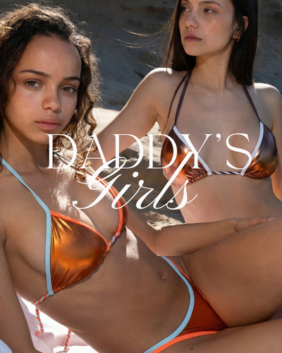
Best Bikini Colour for Your Skin Tone: The Expert Guide to a Glowing Look
· 7 min read

Choosing a bikini usually comes down to visual impulse: seeing a photo, falling in love with a design and picturing it on a holiday afternoon. Yet we've all tried on a piece with a flawless design and noticed in the mirror that something isn't quite right: your face looks dull, the contrast washes out your silhouette or the colour seems to compete with your skin instead of complementing it.
The explanation isn't in the pattern or your body, but in applied colour analysis.
Colour in swimwear doesn't behave as it does in an ordinary winter garment. In a bikini, the area of exposed skin far exceeds the area of fabric. The colour of the piece comes into direct contact with your natural pigmentation, interacting with your skin's undertone and casting reflections on your torso, neckline and face. Add metallic fabrics to the equation — able to refract direct sunlight and sunset shadows — and understanding which colour families boost your glow becomes the ultimate tool for never hesitating over the collection again.
1. The first step: telling skin tone and undertone apart
One of the most common mistakes when choosing swimwear is only looking at whether we're “very pale” or “very tanned”. That's your surface tone, and it changes over the weeks depending on sun exposure.
What really decides whether a metallic shade lights you up or dulls you is your undertone, a genetic, unchanging quality of the skin that stays the same in the depths of winter and after two weeks on the coast:
-
Warm undertone: Yellow, golden, peach or sallow pigments dominate beneath the skin. When they tan, these skins easily take on a golden or toasted hue without burning too quickly.
-
Cool undertone: Pink, bluish or reddish hues dominate. These skins tend to redden easily in the sun, often with freckles, or have very specific greyish olive tones that respond better to pure pigments.
-
Neutral undertone: A harmonious balance of golden and pink pigments, which gives almost total versatility when playing with the colour palette.
Three quick tests to identify your undertone at home
-
The wrist vein test: Look at them in direct natural light. If they look greenish or olive, your undertone is warm. If they lean towards violet-blue or purple, it's cool. If blue and green tones coexist with no clear winner, your undertone is neutral.
-
The white paper test: Hold a sheet of bright white paper under your completely clean face and neckline in front of the mirror. If your skin looks yellowish or creamy next to the paper, you're warm; if it looks pink, bluish or translucent, you're cool.
-
The classic jewellery test: If you instinctively feel that gold chains and earrings brighten you up and make you look well, your colouring is warm. If silver looks cleaner against your skin, your colouring belongs to the cool range.
2. The Quelton colour map: how each finish works on your silhouette
Quelton's limited edition fabrics aren't flat dyes; they're designed with a shimmering weave whose intensity changes with the angle of the light. Let's look at how each iconic shade behaves:
A. The warm range: Bronze, Aperol and Gold
-
The energy of the colour: These shades are built on a base rich in ochre, copper and reflective gold pigments.
-
Who they flatter most: They're the undisputed allies of women with a warm undertone and skin that quickly takes on caramel or cinnamon hues. Bronze, for example, blends harmoniously with golden melanin, creating a seamless, ultra-glamorous “liquid skin” effect.
-
On fair warm skin (redheads, blondes with honey eyes or brunettes with fair skin): Aperol adds an instant vitamin boost that breaks the early-season pallor without harsh contrast, giving your neckline a healthy, vibrant look.

B. The cool, high-impact range: Cherry, Metallic Blue and Silver
-
The energy of the colour: Colours with a bluish base, deep cherry or pure silver reflections. They contain no earth or ochre pigments.
-
Who they flatter most: Skin with a cool undertone, whether very fair porcelain (Snow White style) or deep skin with an ashy base.
-
The visual effect: Cherry on fair cool skin creates an architectural, sophisticated contrast: the cool base of the skin makes the ruby of the bikini stand out with magnetic intensity, without casting yellowish shadows on the chest. If you have dark brown or black hair and light or dark cool-toned eyes, this range is your safe bet.

C. The versatile, balanced range: Champagne and Yacht
-
The energy of the colour: Luminous sand tones, iridescent pearl and clean neutral hues.
-
Who they flatter most: Their colour neutrality means they work brilliantly on all skin types and undertones, making them the ultimate go-anywhere investment.
-
The visual effect: On skin that hasn't tanned yet at the start of summer, Champagne adds a subtle, elegant satin halo without dulling it. As your skin tans, the shade creates a soft, clean contrast that naturally enhances your tan, with nothing garish.

3. Colour matrix: find your ideal combination
| Skin undertone | Typical surface tone | Most flattering Quelton shade | Effect on the silhouette |
| Warm | Light peach, golden, deep tan | Bronze / Aperol / Gold | Boosts natural golden highlights; total glow effect. |
| Cool | Rosy porcelain, ivory, ashy brown | Cherry / Metallic Blue | Clean, magnetic contrast; defines the silhouette without dulling the complexion. |
| Neutral | Balanced beige, medium hazel | Champagne / Yacht | Classic elegance; works with any level of tan. |
| Very fair (start of season) | Any undertone with no previous sun exposure | Lime / Champagne / Cherry |
Breaks the monotony: neon or cherry adds instant light. |
4. Strategy by stage of summer: how your tan evolves
Your relationship with colour changes as the season goes on. Knowing how to match your bikinis to the different stages of sun exposure will help you look flawless from your first getaway in June to the last days of September:
Stage 1: First days in the sun (untanned skin)
At the start of the holidays, many women make the mistake of hiding in dull dark shades or flat browns to “go unnoticed”. This only accentuates the pale look.
-
The strategy: Go for shades with vibrant personality such as Lime or jewel tones such as Cherry. Fresh colours draw attention away from the lack of tan and bring energy to your face, so your skin looks luminous from the very first minute.
Stage 2: Peak tan (satiny, golden skin)
Once melanin has done its job and your skin has its established summer tone, the rules shift towards harmonious contrasts.
-
The strategy: This is the prime moment for shades such as Bronze, Champagne or Yacht. The contrast between shimmering fabric and tanned skin creates that catwalk effect where the piece seems part of your body. A balconette top in Bronze under the sunset creates unbeatable visual impact.
5. Visual volume: how shine affects proportions
Colour doesn't just communicate light and temperature; it also directly affects how we perceive body volume. Shiny and metallic finishes reflect more light than matt ones, and the human eye tends to read the points of greatest reflection as areas with more volume or projection.
Using this optical quality lets you balance your silhouette naturally by choosing separates:
-
To visually enhance your bust: If you have a small or medium bust and want to give it more presence without rigid padding, choose tops in light or highly reflective shades (Champagne, Aperol or Lime). The reflection of metallic fabric at the neckline creates an optical illusion of greater size and shape.
-
To streamline your hips: If you want your lower half to look cleaner and neater, pair your shiny top with bikini bottoms in deeper shades (Bronze or Cherry), or choose high-leg cuts that lengthen the line of the leg.
-
Monochrome total look: Wearing the same metallic shade top to bottom streamlines your whole figure, as it creates a continuous, unbroken vertical line that lengthens the torso and adds height.
6. Beyond the rules: your attitude defines your style
Colour analysis guidelines are a technical guide designed to make choosing easier, answer questions and help you understand why certain shades make you glow instantly. However, at Quelton no technical rule is more important than your personality and how a piece makes you feel.
The No basic, stay iconic philosophy is about wearing your pieces with confidence, owning the cut and enjoying the feeling of looking spectacular. If your undertone is cool but you dream of a Bronze bikini, wear it proudly: just balance it with silver jewellery or accessories that connect you to your natural palette.
A well-sewn designer piece, with a supportive pattern and a fabric you'll love to touch, always looks good when you decide to make it yours.
Want to find out which shade suits your skin tone? Explore our range of metallics on the website, try our interactive style guide or tag us in your favourite looks using #IconicQueltons.


